Turn Your Email Signature into a Marketing Secret Weapon
Think of the most common thing you do during the work day.
If sending email isn’t the first thing you thought of, I bet it is at least in your top three. While the body of your emails should already be used to the fullest potential, oftentimes one difference-making section can be overlooked: the email signature.
It’s no secret the team members here at Sigstr are true believers in the ever-versatile office email signature. We love seeing our industry colleagues share our enthusiasm! When we saw Glenn Leibowitz’s Inc.com op-ed, How a Simple Tweak Can Turn Your Email Into a Powerful Marketing Weapon, we just couldn’t hush our excitement! Leibowitz gave a detailed look at email signature marketing, calling on our very own Sigstr founder and CEO Dan Hanrahan for advice on best practices.
Leibowitz, who is currently the head of communications at a global management consulting firm and recently named by LinkedIn as a “Top Voice in marketing and social media,” used the article to highlight six easy and creative ways to take the office email signature to the next level. We agree with these steps, so much that we outlined his recommendations below:
1. Include a CTA That Changes Frequently
Include CTAs in your email signatures so your team can gather more information on your audience and readers. You’ll also be able to track who is clicking on what links to turn your email audience into potential customers. Keep your CTAs updated and change them often enough so the content doesn’t get stale.
2. Use Graphics…But Not Too Many
As Leibowitz pointed out, graphics can bring an otherwise dull (read: text-only) email signature to life. But he agreed with Dan Hanrahan, your graphics shouldn’t overwhelm your message – keep them to a max height of 100 pixels. Plus, some email providers strip away all images automatically, so make sure you have backup text options in place, just in case.
3. Include Social Icons
Your social media channels are the voice of your organization and, therefore, are often the best place for potential customers to get to know who you are and what you do. Pick your top two or three platforms and highlight the icons in your signature for maximum impact – and maximum followers.
4. Minimize Variety of Colors & Fonts
Keep your color palette limited to your brand’s most recognizable colors, and only pick a few to highlight. Also stick to one or two fonts in your email signature to keep it looking clean and professional. Your email recipients should be able to understand your message and pick up on your CTA quickly without wading through a mess of colors and fonts.
5. Use Design Hierarchy to Catch Your Reader’s Eyes
What’s the most important part of your email signature? Is it your name? Your company logo? Your CTA? Use design hierarchy rules such as font size, color and line weight to draw your reader’s eyes and attention to what matters most in your signature.
6. Stick to the Basics
Leibowitz saved the best for last here. Don’t try to push out too much information – stick to your name, contact info, social icons and a clear CTA for maximum interactions and engagement.
Need Some Email Sigspiration?
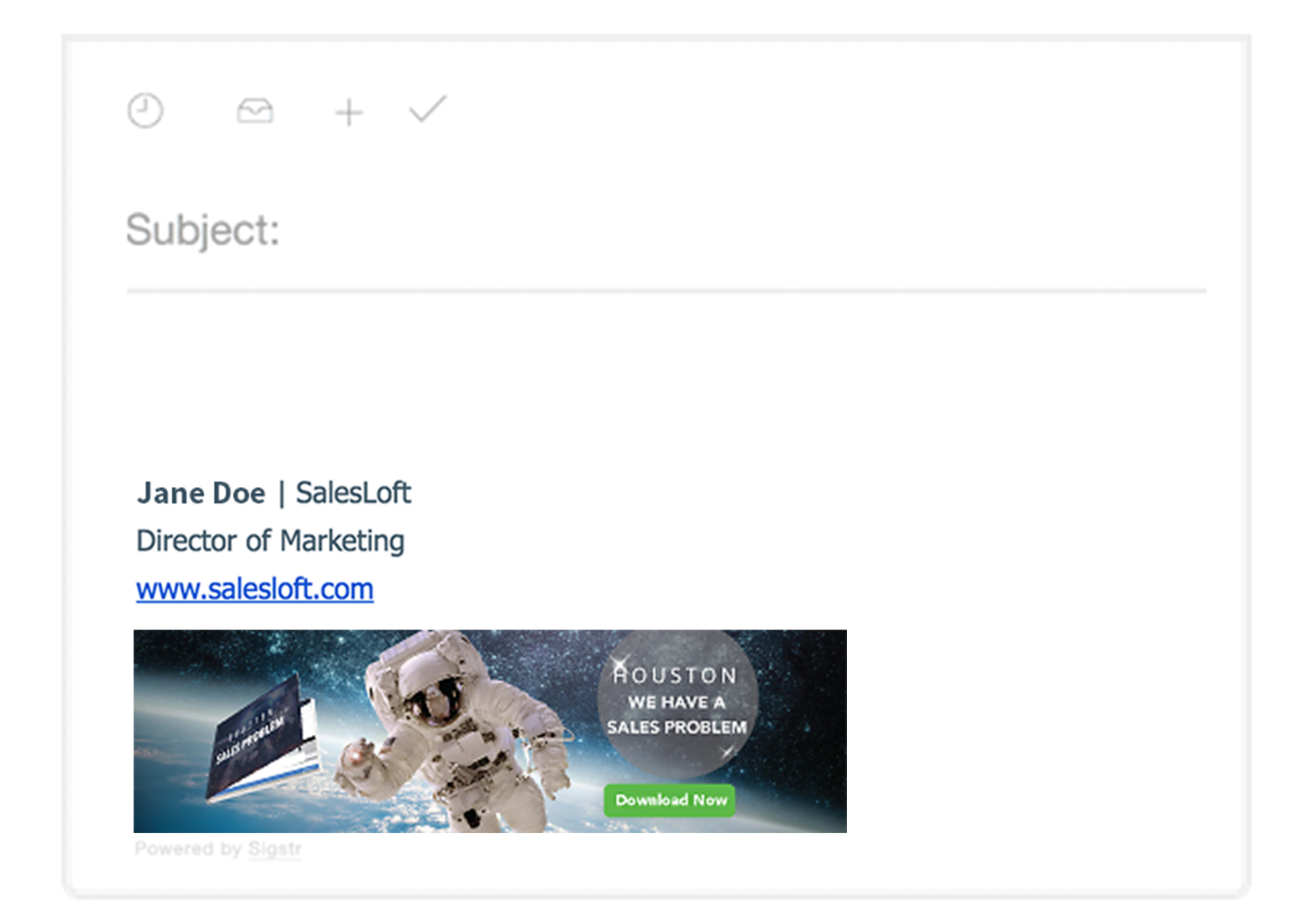
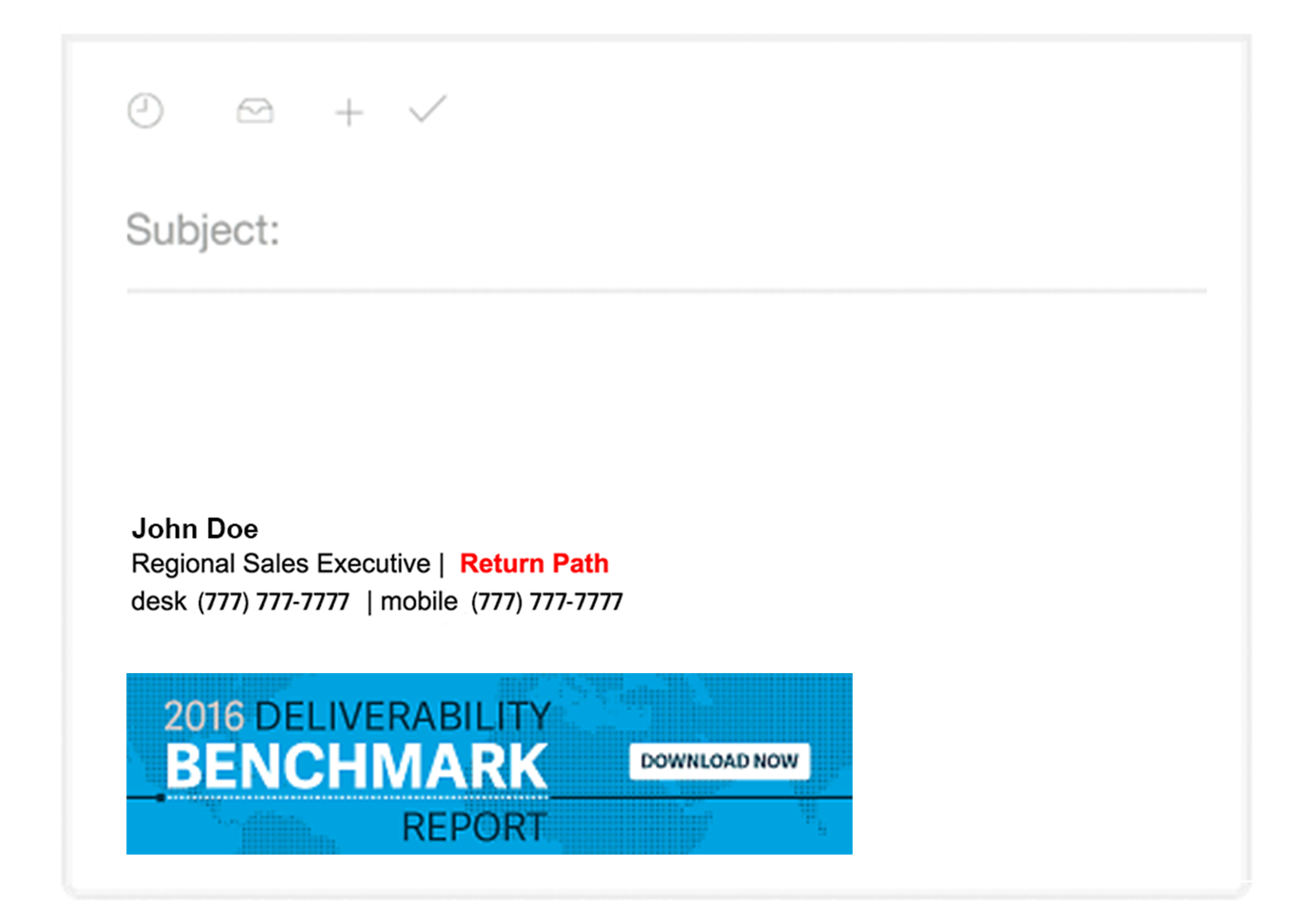
Here are a few examples of great email signatures that our team loves, and we think you will too:


Ready to put your office email signature to work at your organization? Schedule your Sigstr demo today to see how you can kick-start the “marketing secret weapon” that is employee email signatures.